Stowbird
Brand Development
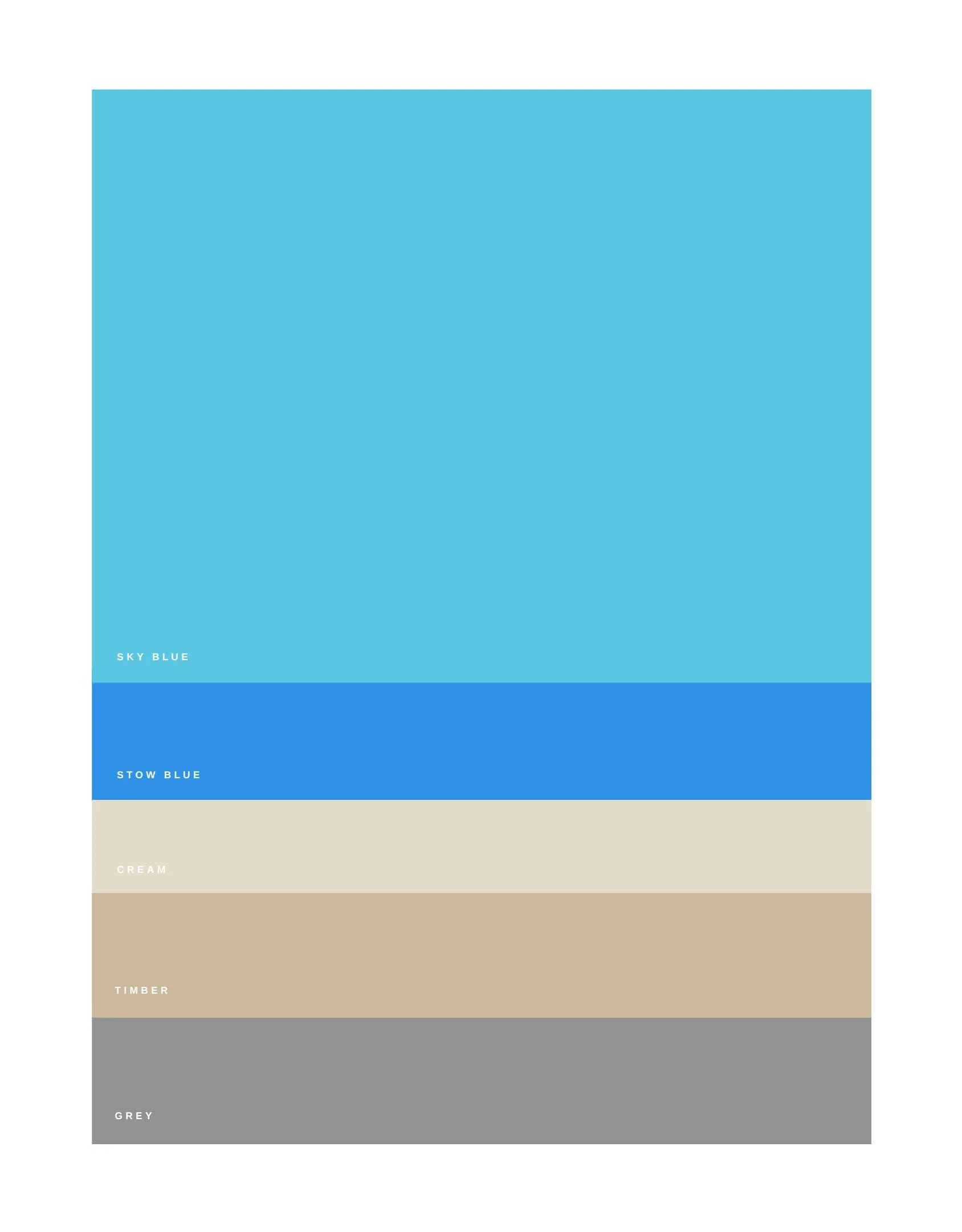
A new kind of storage space. Clean. Connected. Watching over your stuff like a mother hen. Obviously, a brand like this deserved more than typeface and color scheme.
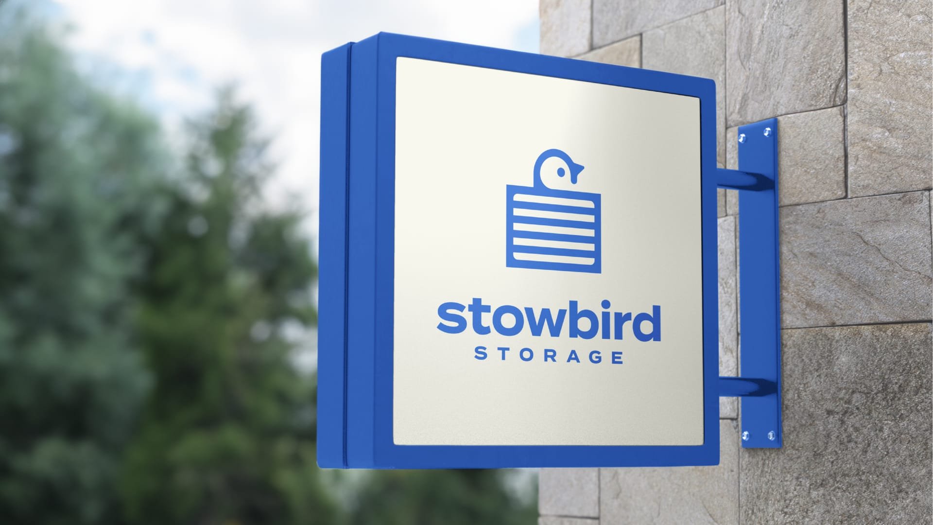
Strategy and creativity came together here with all the precision of a finely-tuned padlock. Which exactly what the brand identity became. A lock with the face of bird, watching over your stuff. A modern, loveable and clean approach to an industry that’s normally dusty and covered in cobwebs.


